
I accepted the job, Googled the address and was ecstatic to find that it was less than a 2 miles away. I packed up my Wacom pad into my European carryall Man-satchel and hopped onto my bike. I've got a GT road bike, XXL. I can get 50 miles to the gallon on that hog.
Big Block is the entire second floor of an office building on Wilshire. It's pretty impressive. They definitely know what they're doing over there, not for their actual work (which is top notch), but for the sheer fact that they have a parking lot. A parking lot in LA. What? I know. Even though I rode my bicycle I had a serious case of the parking lot envies going.
I received the brief from the Creative Director and the Producer (names are withheld because I'm not sure anybody would want to be mentioned on my somewhat perverse and always irreverent blogging) and I began drawing.
The CD (Creative Director) wanted it graphic and impactful. He cited some pieces from my website that he liked and we browsed other folks' work so that I could get the gist. I like when someone gives me a starting point. Without a starting point, I find it difficult to find an ending point. There's some wisdom for you.
Ok, so taking in the direction from the CD, here's my first pass of drawings.


The CD dug it. He liked that it was a fresh take on FORD. 'Let's ditch some of the things they did in the past and let's try something new!' I was on board, the producer was on board. We were all on board.
However, FORD was not on board. They didn't like it. It went too far. It was too stylized. Too off-brand. I get it. Yes, it's off-brand. I see that.
We needed to add a car that was more dimensional, they said. In fact, everything needed to feel less illustrative, they said. Needed to add some photos in there to get this thing back up to par, and on brand.
I had a tough time thinking how to merge photo real elements with graphic elements. It's one way or the other, I thought dumbly. I poured over reference imagery and ended up finding a happy medium, we all hoped.
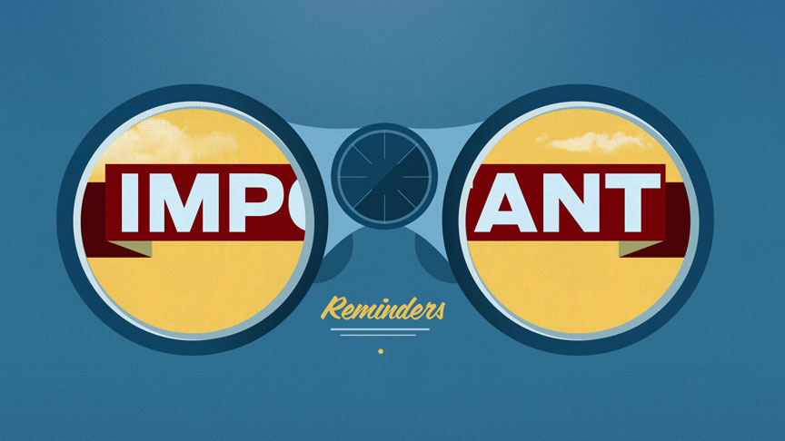
After a few days, I made these drawlings/designs/concepts.


FORD wanted the car front and center. They wanted the color palette more 'airy' and light. They wanted the colors to be on brand. They wanted it to get back out of illustration land.
Fortunately for us, they dug this most recent posting. The car element was given to me by one of the CG artists on the project, and it really helped to 'mature' up the spot. I think we struck a nice balance between photo real (clouds, trees) and graphic.
I chipped in on storyboards on this spot, as well, a facet that I've not gotten into all that often out here. Storyboarding is tough work, as the pacing is controlled by the script to such a degree that it's tough to know exactly how long each shot will be until you get the scratch Voice Over approved. Some shots that have an elaborate set up and might take awhile to push through in your boards will actually get trimmed down to a measly few frames once the V.O. has been approved.
All in all, I'm really happy with the work we did together at Big Block, and after seeing the final, am proud of the finished product.
Here's the final spot!
No comments:
Post a Comment