It's almost that time of the year again. When the leaves turn orange and fall to the ground. When you eat too much and fall to the ground. When all is well and good and your extended family of nine is in town for thirteen days, staying with you and your wife, in your two bedroom house, and your mother-in-law is nagging you about her lack of a grandchild and your Uncle is working himself over in your guest bathroom to last year's Land's End catalog.
Yes, my friends, the Holidays are nigh upon us.
Recently I was hired to draw images for Whole Foods, a large grocery store chain serving the greater United States region. Whole Foods serves everything that the other grocery store chains serve, only with higher prices. Oh, and more 'Organic' stickers. Umm, and with more fashionably attractive people inside purchasing kale salad, pecans, and sushi in plastic containers. Most everyone inside has a Prius outside. Usually adorned with a rainbow or a hemp leaf, whatev, I don't judge, I simple observe and then generalize.
There's nothing wrong with anything I've said so far.
This 'Whole Foods' project came to CLAUS through Brand New School, daresay one of my favoritest studios in Santa Monica, California, the city in which I reside.
Whole Foods needed a commercial for the Holidays. They didn't want to shoot any actors for this commercial. The agency had a script and it called for some illustration and graphical designs to tell a story.
The Art Director at BNS was Kris Wong, with whom I've worked on numerous projects for over the year and a half I've lived out here. I did the Nasdaq gig with Kris. I know what he digs, and more importantly, when he hires me, I know what the man wants to see, which is usually what the client wants to see.
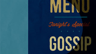
So, I cracked my knuckles, bounced my pecs a few times, got my wacom strapped in my bag which was slung about my shoulders, hopped on my bike, and got my ass to BNS, where the following frames were done over the span of two days.
Bold. Graphic. Colorful. Simple. My four favorite words that aren't Strudel, Lactate, Bordello, and Moist. I must confess to you, unknown reader, I don't watch TV all that much anymore. A few shows, here and there, probably the exact same ones you watch, but I don't turn the TV on often. I find that when I do though, I see that commercials aren't simple enough anymore.
Commercials have 'Projectile Vomit Everywhere All The Time' syndrome. They think that by cutting it fast, making it quick, jamming it packed with a whole lotta tip rubs and ass slaps that we will remember it. Wellp, we don't. I find that the only commercials I ever remember are the ones that are written well. Maybe that's the humorist coming out of me, the writer.
But the graphic ones? I don't know what the product is half the time. So when I get the chance to design commercials (not write them, mind you, this is strictly talking about designing), I find I just want to make cool posters. Horizontal, 1920 x 1080 pixel posters at 72 dpi. If I can achieve that, then there's a chance that someone might stop, take note of the commercial, enjoy it, take something from it, and we would achieve success. We'd CONNECT.
That's the goal, always. To halt your tweeting, facebooking, blogging (ahem), instagramming, pinning. To make you stop for a second and take in some gosh-darned commerce. HA. Stop using that product so I can sell you another! Ouch. This is getting cyclical and my head just started hurting.
So, let's move on to food! Kris asked me to draw all the Holiday food I could in my style, so I drew these the next day.
It took quite a bit of time to make these shapes as iconic as I could in the time given. Whole Foods' current print campaign has flat illustrations of food as well, but theirs have shadows and some tiny lineworkings, which help out in describing each food items' form. Unfortunately, this also makes them feel 'clip-arty'. Just a bit stale, if you ask me. I tried to achieve an essence. Certain foods stylistically work better than others, but I think depicting some from the top and some from the side is a valuable strategy, as some foods just work better from one angle or the other. For instance, drawing the mashed potatoes from the top would have driven me insane.
At any rate, I'd like to tweak further, but I only had a day, so that's where we left it. The agency apparently wants to make it a poster for Whole Foods. I like this idea. I'd LOVE this idea if I was to get paid for every poster that hung in every Whole Foods. Smiley face/winkey face.
There you have it! Some Holiday cheer for Whole Foods. I don't know when this spot will air, or if it will look like this at all, but it was a helluva fun project to work on and I'm looking forward to sharing the next one with you!


No comments:
Post a Comment